Stumbled Upon …
I’ve had requests to share my Heirloom Recipe Ingestor project, but it’s still in the hacked-together stage, not ready. I’ve been wanting to clean it up, and when I made updates to use the non-preview GPT-4-turbo model that OpenAI released on April 9th, I began cleaning up the code.
To make the project public, though, I wanted to do more significant remodeling. One example: the script currently runs in CLI mode with arguments, but it’s not implemented in the latest-best-Python way, and I’d definitely want to correct that. (Typer from Tiangolo looks like a promising solution, by the way).
As I was mulling this, I came across a pair of new Vision examples in the OpenAI Cookbook. Besides finding the examples very useful, I noted that OpenAI shared these as a Jupyter Notebook, rather than as a traditional Python project. That got me wondering if maybe I should the same approach for Recipe Ingestor.
Before I commit heavily to a particular technology or platform, I like to survey of the state of the art in that particular niche. So before committing to Jupyter Notebook / Jupyter Lab, I did a quick survey of the state of the art in data notebooks—was there an up-and-coming alternative to Jupyter I should be looking at?
My Kagi search returned hits for Observable Notebooks, a tool I had peripheral awareness of through Simon Willison, who regularly publishes work in Observable Notebook form, when that format seems a better fit than, say, a simple Python script.
So I dropped in over at ObservableHQ to get up to speed on Observable Notebooks—only to find that Observable had changed course. Though Observable Notebooks are still alive and well (and will, I suspect, get even better, as of February, the company’s primary focus has shifted to what they are calling Observable Framework. That led me down one final rabbit hole, but a very useful one, as I soon realized that Framework was a perfect fit for one of my fractional CTO client’s “data science reporting and dashboard” needs.
The Need
The client in question is a non-profit doing great work in sustainable agriculture, helping farms take informed action based on soil data. The majority of their team are data scientists. Lots of data has been collected, and now the data team is charged with producing useful, coherent, actionable outputs for our users, who are mostly farmers.
The data team works mostly in the R language, one of the primary languages of data science. R is widely used in agricultural data and particularly soil analysis. R is a data manipulation, aggregation, and analysis powerhouse, with plotting and charting libraries capable of a wide range of data visualizations. That said, R’s natural mode of operation is one-on-one with the data scientist; output is more about “produce those charts we need for that scientific paper” than “create awesome reports and dashboards for our users.” R can “do web stuff” in a number of ways, for example using the Shiny package, but it feels a bit unnatural and bolted-on.
The non-profit’s primary user-facing (farmer-facing!) platform, on the other hand, sits solidly in the center of mainstream, modern web / mobile. Logic is JavaScript / TypeScript, running inside open source frameworks like Node.js, React and React Native, augmented by dozens more open source libraries filling niches like Object Relational Mapping (Drizzle). Data lives in the powerful, scalable Postgres open source database.
All of this deploys gracefully onto modern AWS infrastructure, and the result is capable of supporting tens of thousands of web and mobile users. Costs are low—tooling costs almost zero—and the result has been highly effective for developers and enabled us to deliver an excellent web and mobile experience for our users.
We Have Questions
This left me asking a number of questions:
- What is R really best at? Is it the data manipulation and analysis side or also data visualization?
- Does R have enough advantages for our data science use cases to stick with it?
- If R can’t “do it all,” should we move away from it?
- Where is the line between “use R for this” and “this would probably better be handled with something else”?
- If we don’t use R for visualizations, what would we use instead?
- Aren’t we reinventing the wheel here—hasn’t somebody already figured this out? Isn’t there some kind of framework that at least provides a clean separation of concerns between data and presentation?
Enter Observable Framework
With these questions swirling around in my mind, it was a truly fortuitous moment when I landed on the Observable website and began to get my head around Observable Framework.Because, once I understood it, bang, my entire set of questions were answered, and the solution was beautiful. Thank you Mike Bostock and team.
Observable describes Framework as “solving data’s last mile problem.” This is a reference to the telecom world where by far the most expensive part of their network is that last mile, connecting up the actual consumers. For data, Observable is saying, that last mile is getting data onto the screen of the user in need, in a way that is highly useful and actionable—and that this is the hardest problem to solve.
Eureka! This is it! The last mile problem is exactly what my non-profit was struggling with. And wow, does Framework solve it elegantly.
We Have Answers
Let’s look at the answers Framework gives us:
- Q: Does R have enough advantages for our data science use cases to stick with it?
- A: In soil science, it sure seems to. But, not to worry, you’re free to mix and match—use whatever data science tool fits best in each situation—R, Python, Julia, TypeScript, whatever. [link to O blog post about data loaders]
- Q: If R can’t “do it all,” should we move away from it?
- A: R doesn’t need to do it all—just use it wherever it’s the best tool, which, in soil science, is frequently.
- Q: Where is the line between “use R for this” and “this would probably better be handled with something else, e.g. mainstream web tech”?
- A: Although R can create visualizations, its sweet spot is data. Framework’s separation of concerns allows us to use R in its data sweet spot, while applying modern web technology for the presentation layer including visualizations.
- Q: If we don’t use R for visualizations, what would we use instead?
- A: In Framework, the general answer for visualizations—and the presentation layer generally—is “use modern web technology.” This consists of basic web building blocks—HTML, JavaScript, CSS, Markdown—augmented by any of the dozens of powerful visualization libraries that exist in the modern web, most free and open source. The cherry on top is that Observable’s founders and team happen to have built two of the best viz libraries in existence—details below when we dig into the presentation layer.
- Q: Aren’t we reinventing the wheel here—hasn’t somebody already figured this out? Isn’t there some kind of framework that at least provides a clean separation of concerns between data and presentation?
- A: Yes, someone has figured it out! In Framework, Observable have an exceptionally elegant framework, with clean separation of concerns between data and presentation among its many benefits.
Data Layer 1: Data Loaders
In Framework, Data Loaders are the data layer, the first step towards getting data onto the screen, be it for a dashboard, report, or other data visualization. The data files created by Data Loaders power the reports and visualizations of the presentation layer that we explore later.
Data Loaders can be written the language of your choice: data science languages like R, Python, and Julia, but also JavaScript, TypeScript, Java, Rust, Go, PHP, and even shell scripts. This is huge—let data scientists and developers use their tool of choice, whatever best fits the need. Mix and match at will.
Does loading data with a shell script sound crazy? You might be surprised. Here’s a one-line Data Loader shell script that downloads recent earthquakes from the USGS in GeoJSON format:
curl https://earthquake.usgs.gov/earthquakes/feed/v1.0/summary/all_day.geojson
Thanks to Framework’s clean separation of concerns and elegant design, Data Loaders are simple programs—just connect to your data, wherever it is—database, data warehouse, cloud APIs, or all of the above. Join, transform, reshape, and munge it to your heart’s content. When done, simply dump the output, in almost any data format, to standard output. Framework automatically runs the Data Loader during the build process, intercepts its output and creates the output file, ready for use by the presentation layer.
Since Data Loaders run at build time—rather than runtime in front of an impatient data consumer—there’s less need to optimize code and queries. Shell script curl command a little slow? Who cares! Database indexes not optimized for this query? No worries! Cloud API introduce a lot of latency? No harm no foul! It’s build time, not runtime—time is measured differently here. Keep it simple.
Data Loaders really are simple—in developing our own proof of concept, I created five Data Loaders that connected to an RDS Postgres cluster and a pair of cloud APIs, producing both CSV and Apache Parquet files, in just a few hours.
Data Layer 2: Static Generation, Dynamic Dashboards
As you read this post, you’re benefitting from “static site generation.” The Crafty website is built using the static site generator Hugo. There’s no server runtime behind this site—everything’s pre-generated at build time, including HTML for every page, optimized images for every window size, optimized CSS and JavaScript where needed. No server round-trips for anything, just the initial page load. Even dynamic functions like site search run locally in the browser via JavaScript. Navigate around a little, it’s lightning-fast.
The “lightning-fast” part seems to have appealed to the folks at Observable, who recognized that static site generation could work its magic for data dashboards as well—that “statically generated, lightning-fast” and “dynamic, interactive user experience” aren’t mutually exclusive.
There’s a catch, though: lightning-fast user experiences can’t happen if the data’s slow. And slow is typical with traditional data warehouse + dataviz / BI tools. Executing complex queries in real time against remote data can take 10s of seconds and sometimes minutes—while the user waits impatiently.
Well, guess what: those same Data Loaders whose elegant separation of concerns simplify the gathering of data for dynamic dashboards and reports, also solve the slow data problem. Data Loaders do the time-consuming work of querying and collecting data at build time. At runtime, the data is already pre-generated, cached, and ready to access in milliseconds. So thanks to static generation and Data Loaders, Framework is able to deliver a near-instantaneous interactive experience for data.
Data Layer 3: How Fresh is Fresh Enough?
You may still be having doubts about the idea of a data dashboard that isn’t driven by live, real-time data. It’s natural to conflate “dynamic, interactive data consumer experience,” which we’re all in favor of, with “querying live data from a remote database, data warehouse, or cloud API in real time,” which isn’t necessary most of the time and often ruins that interactive experience by making it slow.
I love these two tips in Observable’s excellent Data Loader documentation, because they hit the nail on the head around “how fresh does my data need to be?” Tip 1:
I’d paraphrase the first part of this tip as “Dude, if you really want up-to-the-second data, we gotcha covered!” The second part addresses a Framework nuance that I haven’t yet mentioned: databases and data warehouses aren’t the only source of essential data for dashboards and reports—often times static files from various external sources can be just as essential. For example, in our proof a concept, I needed to plot soil sample locations on maps, for both the entire U.S., and then for individual states. To get the country and state outlines needed as the backdrop for my plots, I just included a publicly-available, 842K static JSON file in my Framework project. The file uses a variant of GeoJSON called TopoJSON and includes outlines of the U.S. itself, along with every state, and every county. Observable Plot, which we explore below, understands TopoJSON and easily produces the geographical plot needed. Tip 2:
The second tip addresses a critical supporting tool for Data Loaders and data freshness in Framework: Continuous Deployment. In parallel with the tremendous progress made in static site generation through projects like Hugo, the tooling for Continuous Integration/Continuous Deployment (CI/CD) has radically improved and become ubiquitous. In fact, the two spaces intersect significantly: as an example, I rely on CI/CD tools provided as part of Cloudflare Pages to automatically redeploy this site, triggered when I push updates the main branch of my GitHub repo. CI/CD is all about builds, and as the tip tells us, Continuous Deployment combined with Framework Data Loaders means we can “rebuild data as often as you like, ensuring that data is always up-to-date.” GitHub Actions are probably the most widely-used CI/CD tool, and can automate Framework builds so they happen exactly when we need them too, whether that be time based (e.g. once an hour); event based (the new batch of sales data has been processed); or programmatically—any which way you need.
Presentation Layer 1: Markdown
The central element of Framework’s presentation layer is Markdown, which Observable’s documentation elegantly describes:
Markdown is a language for formatting text and content; it’s a lightweight, ergonomic alternative (and complement) to HTML.
In a Framework project, each Markdown file represents one page, such as an interactive dashboard or report. Framework extends Markdown in several powerful ways:
Markdown in Framework extends CommonMark with a handful of features useful for data apps, including reactive JavaScript, HTML, YAML front matter, grids, cards, and notes.
-
Use JavaScript to render charts, inputs, and other dynamic, interactive, and graphical content on the client. JavaScript in Markdown can be expressed either as fenced code blocks or inline expressions. You can also import JavaScript modules to share code across pages.
-
You can write HTML directly into Markdown. HTML is useful for greater control over layout, say to use CSS grid for a responsive bento box layout in a dashboard, or adding an external stylesheet via a link element.
-
The grid class declares a CSS grid container. The grid class is designed to pair with the card class and the dashboard theme for dashboard layout.
-
The card class is used to group and delineate content. The card classes applies a background and border (with colors determined by the current theme).
As we explore later, Framework’s powerful Markdown extensions mean than each Markdown page is equivalent to a full data notebook—actually more powerful than Observable’s own Notebooks, which themselves outshine most other such as Jupyter.
Presentation Layer 2: JavaScript
JavaScript in Framework Markdown is like water to fish—everywhere. From Observable’s docs:
Use JavaScript to render charts, inputs, and other dynamic, interactive, and graphical content on the client. JavaScript in Markdown can be expressed either as fenced code blocks or inline expressions. You can also import JavaScript modules to share code across pages.
-
JavaScript fenced code blocks (```js) are typically used to display content such as charts and inputs. They can also be used to declare top-level variables, say to load data or declare helper functions.
-
Inline expressions ${…} interpolate values into Markdown. They are typically used to display numbers such as metrics, or to arrange visual elements such as charts into rich HTML layouts.
Think of a Framework Markdown page as being wrapped in a JavaScript context, what Observable calls the runtime—not just the ability to run JavaScript code basically anywhere, but also with our full data context available to operate on and visualize.
Presentation Layer 3: Getting the Data
How do we get the data, for example data snapshots created by Data Loaders, available to the presentation layer and accessible via JavaScript? From the Observable docs:
Load files — whether static or generated dynamically by a data loader — using the built-in
FileAttachmentfunction. This is available by default in Markdown.
Here’s a Markdown code block to load a JSON file listing active volcanos:
```js
const volcano = FileAttachment("volcano.json").json();
```
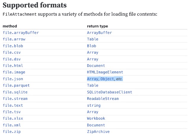
When the variable volcano is referenced in another code block or inline expression, for example in a visualization, it contains the appropriate JavaScript Array, Object, etc. to represent the JSON data. Two magical Framework notes:
- The presentation layer doesn’t need to know if the file
volcano.jsonwas generated by a Data Loader, or was simply included in our project as a static file—Framework manages all of this at build time for us. Specifically, Framework build looks for the filevolcano.json, but if it’s not missing, looks for a Data Loader based on the same name, sayvolcano.json.py, and runs it to generate the data snapshot. - Thanks to reactivity, even though FileAttachment is an async function since it’s reading data from the file system, we don’t need to deal with async logic—the Framework runtime manages this for us automatically.
Here’s a full list of formats that FileAttachment supports:
Presentation Layer 4: Client-side SQL
There’s one more totally amazing way to access data in the presentation layer: client-side SQL. From the Framework docs:
Framework includes built-in support for client-side SQL powered by DuckDB. You can use SQL to query data from CSV, TSV, JSON, Apache Arrow, Apache Parquet, and DuckDB database files, which can either be static or generated by data loaders.
To use SQL, you first register a SQL source in the Markdown doc’s front matter. Here we register a sample Gaia astronomical data source which happens to be in Apache Parquet format:
---
sql:
  gaia: ./data/gaia-sample.parquet
---
The same build-time Data Loader logic we described above applies here—if the file gaia-sample.parquet doesn’t exist, Framework build look for a matching Data Loader such as gaia-sample.parquet.py and run it to create the file.
Now we can query that source from a SQL code block:
```sql id=top10
  SELECT * FROM gaia ORDER BY phot_g_mean_mag LIMIT 10
```
The id=top10 stashes the result of the query in a JavaScript variable:
The value of a SQL code block is an Apache Arrow table. This format is supported by Observable Plot, so you can use SQL and Plot together to visualize data.
So, right in the browser, we’re running live, superfast SQL queries on our data—no server roundtrips and near-instantaneous responsiveness. When paired with Framework reactivity and interactivity, client-side SQL is a huge win for enabling blazing-fast interactive dashboards.
(Framework’s strong Apache Parquet support is a related win. Compared with other data formats, Parquet is very small, very fast, and works great with Framework’s DuckDB-powered SQL.)
Presentation Layer 5: Reactivity
JavaScript in Framework has a superpower: it’s reactive. From the docs:
Framework runs like a spreadsheet: code re-runs automatically when referenced variables change. This brings:
- Easier interactivity because state is automatically kept in sync
- Easier asynchronous programming via implicit await of promises
- Better performance with incremental re-rendering
- Greater flexibility by writing code and prose in any order
Reactivity is especially helpful for data apps because these apps tend to have complex state.
Reactivity was a key differentiating feature of Observable’s first product, Notebooks. In most data notebooks, Jupyter for example, cells execute in a linear order, and the user must manually re-run cells when dependencies change. In contrast, an Observable Notebook …
… knows which cells depend on which others, no matter where they are located in the notebook. So when one of them changes, all values that depend on it are automatically updated. This is also efficient: only those cells that are affected by a change are re-run. That means that you can organize cells in your notebook however you want, without worrying about how the order of operations may be affected.
Reactivity is even better in Framework, because the augmented Markdown format that sits at the heart of Framework’s presentation layer is more powerful and flexible than the original app-based Notebook model. Framework Markdown freely combines content with code; uses vanilla JavaScript rather than a JavaScript dialect with syntax differences; and finally, since a Framework page (the equivalent of a Notebook) is represented by a single, simple text Markdown file, it works flawlessly with source control / CI-CD platforms like GitHub.
Presentation Layer 6: Interactivity
Reactivity brings many benefits, but perhaps shines most brightly when it comes to enabling interactive dashboards, where user inputs dynamically reshape dashboard output.
Framework Inputs support direct user interaction on dashboards and reports. The 14 flavors of Input include Radio, Checkbox, Select, Range, Toggle, Date and eight more.
Let’s make a histogram of soil carbon values, with the width of each histogram bar (and therefore the number of bars) controlled by a Range Input. This code block with a single line of code:
```js
const binWidth = view(Inputs.range([.2, 1], {step: .05, value: .5, label: "Bin Width (%):"}))
```
puts a range slider control onto our dashboard screen, with min/max values of .2 and 1. The JavaScript variable binWidth has an initial value of .5, and gets updated as the user moves the slider left or right. In another code block, Observable Plot’s binX transform references binWidth, and thanks to Framework reactivity, the histogram updates in real time. Here’s the result:
Voila, one line of code, and we’ve got our first interactive dashboard element.
Now let’s take a look at a more complete and interactive dashboard (try it live here), which shows 15- and 30-year fixed mortgage rates from 1971 through the present, using data that is updated weekly and thoughtfully shared by Freddie Mac as a downloadable CSV. A 15-line Node.js JavaScript Data Loader grabs the latest CSV, current to within a week.
As you see below, the upper right card shows a detailed chart of mortgage rates, starting with the past year; while the bottom pane shows a full-history rate chart that covers 1971 through the present. In this case, the interaction isn’t through a Framework Input, but rather through JavaScript click and drag events setting a date range variable startEnd when the user interacts with the lower chart. The detailed chart above right references startEnd and reacts instantly when it changes. All four charts in the dashboard are rendered by Observable Plot.
As you can see, Framework supports highly-interactive experiences for data consumers.
Presentation Layer 7: Visualizations
So far, we’ve covered the data layer including a deep dive on Data Loaders, and many aspects of the presentation layer, from Markdown to interactivity. But what about the visualizations themselves? Here Framework’s options are virtually unlimited: virtually any JavaScript visualization library can be used within Framework. To insert a visualization into a Framework Markdown page, you just call the library from a JavaScript code block or inline expression.
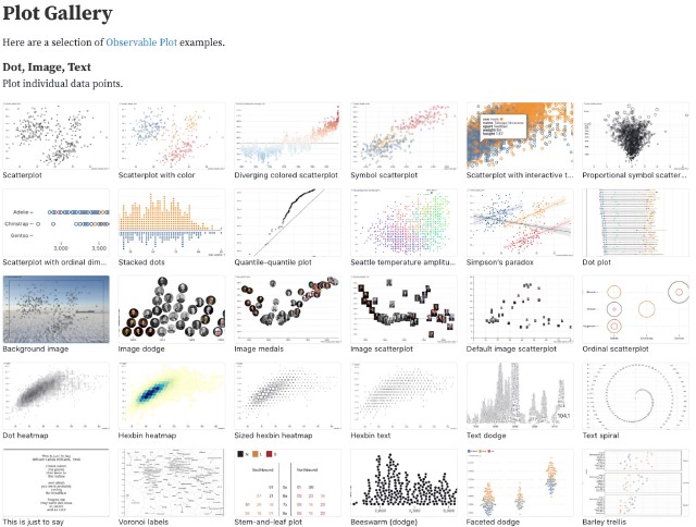
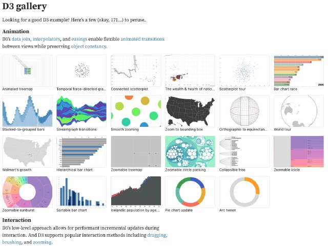
Observable themselves actually created two of the most powerful libraries (both fully open source): Observable Plot, which is built on top of the lower-level D3. Just to give you a taste of what’s possible, here’s a tiny subset of the available examples for Plot and for D3:
But Observable’s own libraries are far from the only options—other widely-used general plotting libraries including Apache ECharts, Plotly, and Vega-Lite work great within Framework.
Mapping-specific libraries such as Leaflet and Mapbox GL JS are fully supported, as are a number of specialized viz libraries such as DOT, Deck.gl, Mermaid, and Mosaic vgplot.
Framework in a Nutshell
Observable’s homepage tagline is:
The best dashboards are built with code.
If one considers the conventional alternatives—a massive SaaS app along the lines of Tableau, where our visualization possibilities are limited by what the SaaS vendor decides we should have—I’ll take dashboards built with code, thank you very much.

